Fall 2017 - Industrial sketch for a class assignment.
Fall 2017 - Industrial sketch for a class assignment.
Spring 2018 - "Hand, Eye, Mind" pencil drawing for a class assignment.
Spring 2018 - "The Circle of Life" pencil drawing for a class assignment.

Top Favorites
Scoop Technologies, Inc.
Allowing people to easily pick their go-to carpool group.
My project role:
Lead Product Designer
Duration:
4 months
Platform:
Mobile (Android and iOS)
1. Background
Previously in the Scoop carpool app, users could "Favorite" one another to increase their chances of matching together in a future carpool. Favoriting didn't need to be a mutual relationship, and it wasn't 100% guaranteed you'd match together.
*Also a note: In the early stages of the project, the team used "Super Favorites/Superfavorites" as a placeholder name, which you'll see in some visuals.
2. Why build Top Favorites?
There were 2 main reasons driving the decision to build the Top Favorites feature:
Firstly, this was an all-time favorite feature request from our users
-
Even prior to COVID-19, being able to choose who you match with was one of the top requested features by carpoolers.
-
People wanted to make sure they matched with spouses, housemates, coworkers, or friends.

An excerpt from a sunburst chart showing requested features from carpoolers as part of the 2020 Q1 Insights Report.
The most number of requested features were about "Matching", and "match to specific person/Favorite" was the #1 feature request.
Secondly, users were concerned about their safety with COVID-19 on the rise
-
Especially as the COVID-19 pandemic was taking off at the time of this project, people were concerned about their health and safety when getting into a carpool with strangers.
-
Scoop users were expressing concern as well as desire to be able to choose specific people to carpool with whom they trust.
![A sunburst chart showing responses from carpoolers as part of 2020 Q3 Pulse Survey. Aside from already existing policies for COVID-19 safety in Scoop carpools, the top "New [Policy]" requested was being able to "choose carpoolers/[consistent carpools]".](https://static.wixstatic.com/media/fb5cf6_e9e7d7163a444430ab8af08794ad1f93~mv2.png/v1/crop/x_5,y_508,w_1467,h_838/fill/w_720,h_411,al_c,q_85,usm_0.66_1.00_0.01,enc_avif,quality_auto/Screen%20Shot%202021-01-26%20at%205_20_01%20PM.png)
An excerpt from a sunburst chart showing responses from carpoolers to the question: "What would make you feel safer while carpooling with Scoop?" as part of the 2020 Q3 Pulse Survey.
Aside from already existing policies for COVID-19 safety in Scoop carpools, the top "New [Policy]" requested was being able to "choose carpoolers/[consistent carpools]".
On top of these 2 reasons, Top Favorites would also be a useful tool in the re-opening phases after the pandemic. Instead of immediately opening carpooling up to everyone, Top Favorites can be used to limit exposure risks.
3. Rethinking "the Matcher"
From the start, it was clear we had a lot of thinking and work to do around the algorithm we called "the Matcher" – so called because it's used to match people in carpools –and how it would change as a result of Top Favorites.
We had several lengthy conversations between the Product Manager, our Matcher Data Engineer, the User Researcher, and me to balance UX and technical constraints.
In the end, we settled on these following rules:
-
Top Favorites won't impact how Favorites currently works in the Matcher system.
-
Top Favorites matches will happen at the same time as all other carpool matches.
-
Top Favorites will match together, even if they exceed detour time limitations.
By fully understanding and preparing for how this feature fits into the Scoop ecosystem, it prepped me with a clearer understanding of constraints, as well as expectations around communicating how this feature works to our users.
4. Starting to think about touchpoints...
Since Scoop already had a pre-existing "Favorites" concept and this feature would operate in a similar way, I decided to make note of all the places in the app where users can Favorite one another. I found that there were 4 main locations:
-
The Community tab
-
Post-trip Feedback
-
Trip History
-
Anywhere you can access a carpooler's profile (ex: Match Details)


On the left, the Trip History view. On the right, the Community tab.
The yellow highlights indicate where "Favorite" actions are available.
5. Brainstorming with UX Research
I collaborated with the project's User Researcher to differentiate 3 user types we'd be designing for.
User types
-
A: People who don't use Scoop currently
-
B: People who form close relationships through Scoop and are interested in Top Favorites
-
C: People who would like to continue using Scoop, but their priority of safety and need for control over their match network has increased.
In addition, I identified several additional circumstances (ex: a user's employer is part of a Managed Carpool Program with Scoop) as well as wrote user scenarios and user stories.
The User Researcher and our Analytics team member also provided their own perspectives to consider, for example the analytics below:

A screenshot from Slack with numbers from an analytics breakdown of where Scoop users currently interact with Favorites the most. 70% of Favorites come from the post-trip Feedback flow.
The hardest challenge...
... was definitely the social part of this feature. We were essentially building an ecosystem similar to "Friend Requests", something unlike any other feature we had in the Scoop app that would require communication and transparency.
6. A fork in the path
I started thinking about general design path directions to take and spent some time in Sketch, exploring different visuals to communicate different conceptual paths.


I narrowed it down to 2 design solution concepts, their differences centered around the Top Favorites versus Favorites distinction.
Concept A: Top Favorites separated from Favorites

Top Favorites (left screen) live in a completely separate view from Favorites (right screen).
Note: These are hi-fidelity designs only used to mock up the concepts.
Concept B: Top Favorites as a "promotion" of Favorites

Favorites and Top Favorites live in the same view. The left screen shows an empty state for "Super Favorites" (our name for Top Favorites at the time). The right screen shows if a user had 1 out of 2 possible Super Favorites filled.
Note: These are hi-fidelity designs only used to mock up the concepts.
I wrote up pros and cons of each approach, and discussed them with the Product Manager and User Researcher. Referring back to our user types, scenarios, stories, as well as technical constraints, we moved forward with Concept B.
7. Prepping for usability testing
I referred back to our user types as well as a high level user flow to guide my design decisions.
.png)
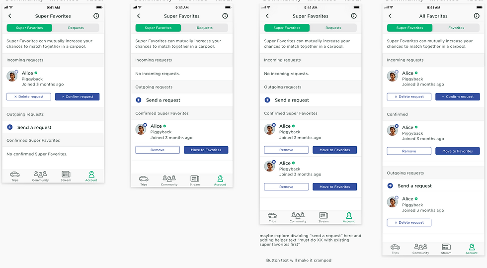
Below are examples of several design iterations I went through, along with notes I took while collaborating with the rest of the project team as well as the Design team.

8. Putting designs to the test
We user tested an InVision prototype I created with a sample of 8 participants including new and experienced users, asking them to complete a series of tasks. Several of the tasks we asked were:
-
Adding someone who isn't on Scoop as a Top Favorite
-
Adding someone they've Favorited as a Top Favorite
-
Accepting a received Top Favorite request
Below are a few screens from the usability prototype, along with a high level view of the 6 different flows I made for the prototype.


Some of the elements that didn't make the final cut after testing: the "Add a Super Favorite" banner, the "Super Favorite confirmed" banner, and the small red circular badges.
9. Making improvements
Post-testing, the User Researcher generated a research report with the major recommendations themed around:
-
Improving discoverability of the feature
-
Ex: The initial empty state wasn't clear to most partipants..
-
-
Stronger education around how the feature impacts matching experience
-
Ex: Participants weren't sure how to coordinate with their Top Favorites in order to make sure they matched together.
-
-
Stronger education around feature limitations
-
Ex: Participants didn't understand they were only allowed 2 maximum Top Favorites until too late.
-
-
Improving usability by eliminating redundant actions
-
Ex: Adding someone as a Top Favorite involved a 2-step process that frustrated participants.
-
10. Final designs
A few screens from the final design.
Top Favorites states


Removing a confirmed Top Favorite


Accepting a pending Top Favorite request


11. But wait, there's more!
Other design work that I did at this stage included:
-
Collaborating on content strategy and copy, such as on the name of the feature
-
Documenting flows
-
Adding new components and icons to our existing component library


12. Building it out with the Engineering team
After I was done with designs, the project team met with the Engineering team for tech planning.
I walked the team through individual screen designs and flows, answered questions, and collaborated on scope cut as well as phasing decisions.

13. The results are in!
As of August 2020, the Top Favorites feature is live in both the Android and iOS mobile apps!
Things I learned a LOT about in this project:
-
Building a social network UI/UX
-
Maintaining trust and safety
-
Working within technical constraints and scope
Things to look forward to in future improvements and iterations:
-
Content strategy - not getting too tied to specific names from the get-go
-
Revisiting improvements that were cut out of scope, especially at the tech planning phase