Fall 2017 - Industrial sketch for a class assignment.
Fall 2017 - Industrial sketch for a class assignment.
Spring 2018 - "Hand, Eye, Mind" pencil drawing for a class assignment.
Spring 2018 - "The Circle of Life" pencil drawing for a class assignment.

Pay on Request
Scoop Technologies, Inc.
My project role:
Lead Product Designer
Duration:
4 months
Attracting more people to drive carpools for Scoop.
Platform:
Mobile (Android and iOS)
1. The challenge
Scoop's main product is a mobile app for people who commute regularly to and from work to arrange carpools. People will fill out scheduling requests either as a Rider or a Driver before a set deadline, and then Scoop will match them into optimal carpools.
However, one pain point is the lack of people signing up as Drivers. Drivers often shoulder more burden: paying for car maintenance and gas, going out of their way to pick up Riders, and expected to be on time when picking up Riders.
Therefore, the primary goal for this Pay on Request feature was to pay people for scheduling to Drive, regardless if they end up matching in a carpool or not.
2. Tying together business and users
I worked alongside the lead Product Manager and User Researcher to write out the business goals, then translate them into target user groups.
Business goals
-
Increase Driver trip frequency
-
Increase Driver activation
-
Increase Driver carpooler retention
-
Increase Driver registration
User groups
-
People who could be scheduling more than they currently are
-
People who have downloaded Scoop, have gone through onboarding, but haven't scheduled a trip (registered people who haven't scheduled a trip)
-
People who are currently using Scoop but eventually stop using it
-
People who would use Scoop, but haven't registered yet
3. Building empathy with our users
I then worked on creating specific user scenarios for each of the 4 user groups in order to identify areas of opportunity and potential touchpoints in their user journeys.
User scenarios
For example, here are the user scenarios I wrote for user group 2:
Jackie saw Scoop tabling on their company campus and downloaded the Scoop app. The first time they open the app, they go through the onboarding flow and then end up in the Community tab.
-
Scenario A: They stop here and close the app.
-
Scenario B: They start to explore the app, tapping through various views. They're not looking for anything specific.
-
Scenario C: They intend to schedule a carpool, so they open the Welcome bottom sheet OR tap on the Trips tab and then the trip card. They fill out the scheduling request for the first time. Once the form is fully complete, they tap the “Next” button and see a modal of what to expect in their first carpool. They dismiss it by tapping “Schedule” and then are returned to the Trips tab.
States
It was also important to factor in how the various carpool status states users can be in could affect the feature - particularly in how we keep people informed about their money incentive.
Here are a few example states:
-
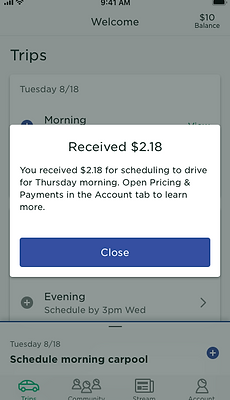
Scheduled a trip: User is informed they are receiving the Pay on Request payment.
-
Matched in a carpool: User is informed they are receiving payment - this may be more, less, or the same as the amount they received for scheduling.
-
Canceled trip: User cancels the carpool they were matched in - therefore they don't receive the Pay on Request payment.
4. Sketching some thoughts
I hand-sketched potential screens we could use as touch points for this feature while trying to reuse existing design system components, such as banners and modals.


5. Checking in with the team
Throughout the early parts of this project, I was often syncing with various stakeholders: the Product Manager, User Researched, Head of User Experience, and Head of Product.
We realized that a critical piece of this feature would be how we position the feature towards our users. This is when we looped in our Lead Content Strategist.
6. Nailing down "the words"
Together with the Lead Content Strategist, we brainstormed several potential positioning approaches:
-
Rewarding users for scheduling
-
Compensating users for not matching in a carpool
-
Upholding Scoop's promise to match people in carpools
-
"No downsides to driving"
Other important questions that came up included:
-
How do we incorporate this feature into the user experience without sounding too promotional?
-
Should we consider a progressive disclosure route of providing information?
-
How do we best educate users throughout their user journeys?
7. Testing "the words"
Our User Researcher recruited 8 Scoop users to hear their opinions on the 4 approaches. Below are the 4 slides we showed the test participants.


Ultimately, Concept A: "Get paid, regardless of matching" had the most positive reactions.
7. A/B and RITE testing
Because there were so many variables we wanted to test, our User Researcher suggested we do a combination of A/B and Rapid Iterative Testing and Evaluation (RITE) testing.
A/B testing
The goal of our A/B tests were to determine which Pricing section UI would perform the best by running participants through the user journey of scheduling a carpool.


On the left, the "View more" prototype. On the right, the "Expand/Collapse" prototype.
RITE testing
After 4 A/B tests, the winner was the "Expand/Collapse" model!
I then made InVision prototypes with the "Expand/Collapse" model in preparation for RITE testing. The prototypes had variations of the following variables:
-
"Total" V. "Additive" pricing
-
A tooltip to draw attention to the Pricing section
-
A new card in the Stream tab announcing the feature
-
Helper text beneath the "Schedule" button
-
Helper text in the Trips tab to inform users of their payment status
-
A modal post-scheduling to inform users of their payment status
Within our 6 RITE tests, when a variable performed well, I'd would keep it for the next test. When a variable performed poorly, I'd remove it.

A screenshot of the Sketch file where I designed screens for the InVision prototypes.
8. Translating findings into designs
Our User Researcher analyzed and created a research shareout deck for the team, which I was then able to use to inform our final hi-fidelity designs.


9. Additional design support
In addition to the individual screen designs, to prepare for hand-off to our engineering team, I also:
-
Created flows in Overflow
-
Created designs for the internal dashboard our customer service team uses
-
Documented different states for new components
All of these designs were shared with the Product, Design, and Engineering teams using Zeplin. We also had a series of tech planning meetings in which I explained the screens and flows to our engineers, made scope-cuts, and separated implementation into phases.


10. Final results
As of Fall 2020, this feature is now live in the Scoop app! This was an incredibly complicated project that involved balancing market growth strategy along with user experience, and participating in positioning testing and RITE testing for the first time was a daunting but really educational experience.
Things I'd change in the future:
-
Being more proactive in tying user needs to business needs
-
Dedicating more buffer time for usability testing
-
Continue figuring out balance of scope and good UX